

Challenge
To develop the Steel City Green brand identity, design an innovative visual aesthetic, commission original assets and guidelines, and create the brand's debut website.
Insight
The effectiveness of a cannabis website is not determined by the complexity of its features, but rather by the quality of the story it tells and how clearly it presents pertinent and relevant product information to interested parties (consumers or buyers). A successful website hinges more on strategic planning than development when executed correctly.
Solution
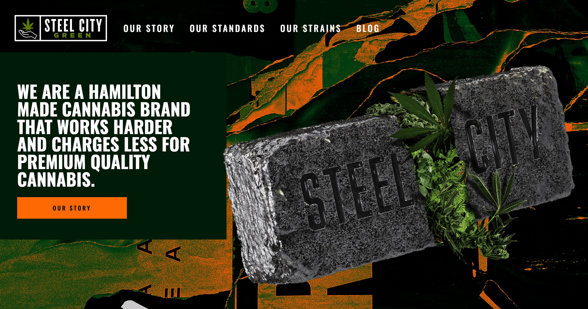
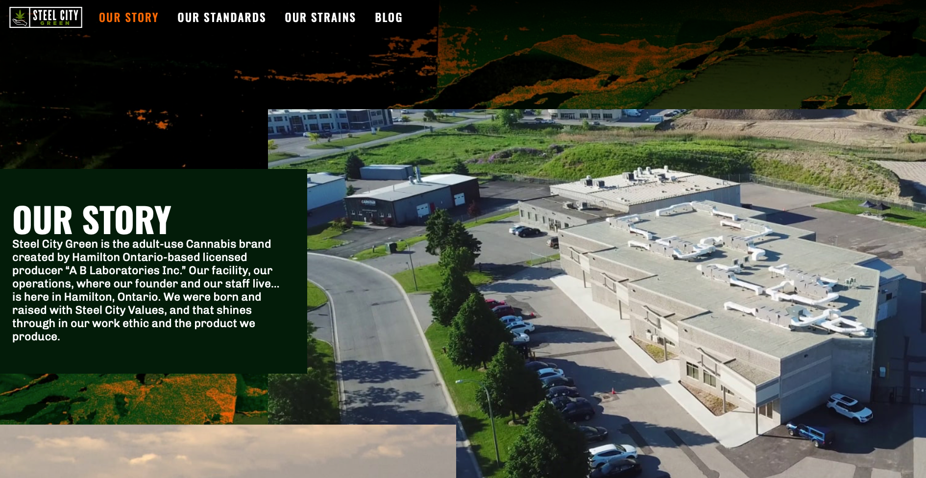
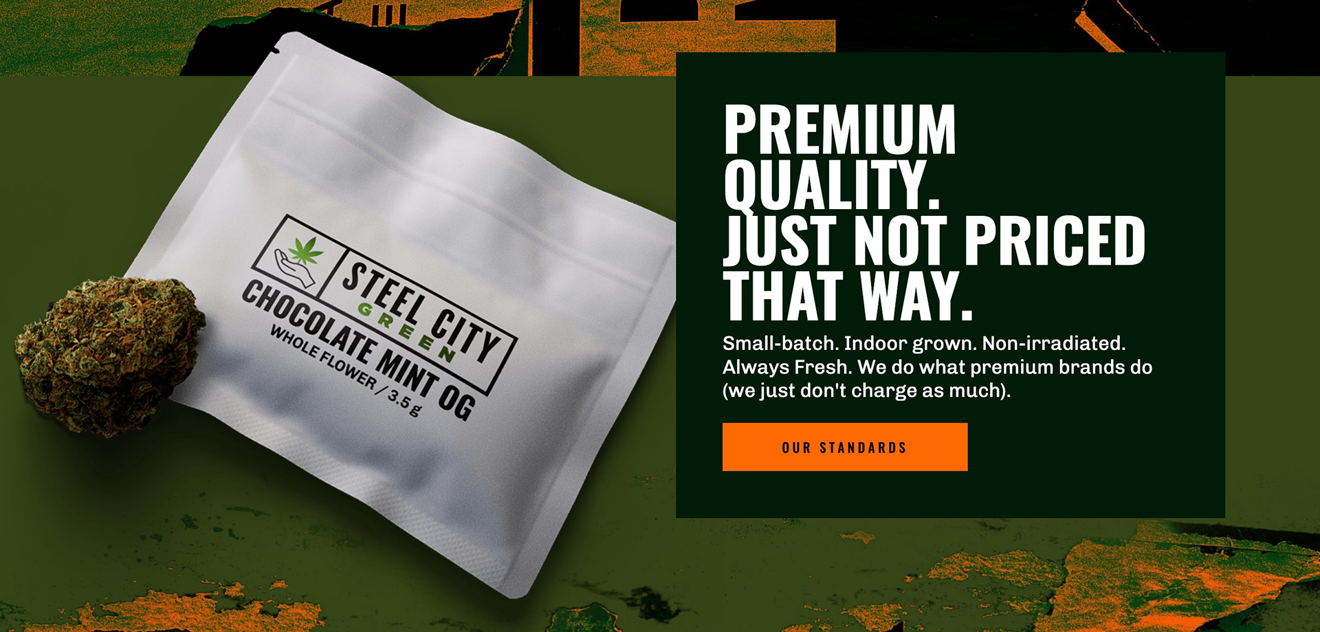
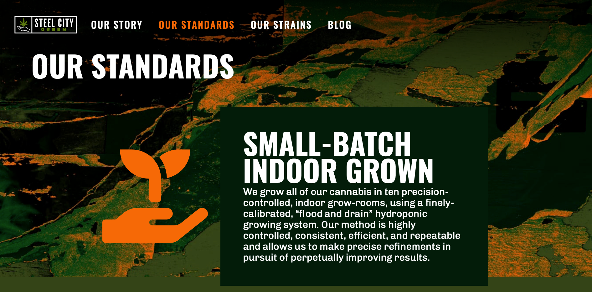
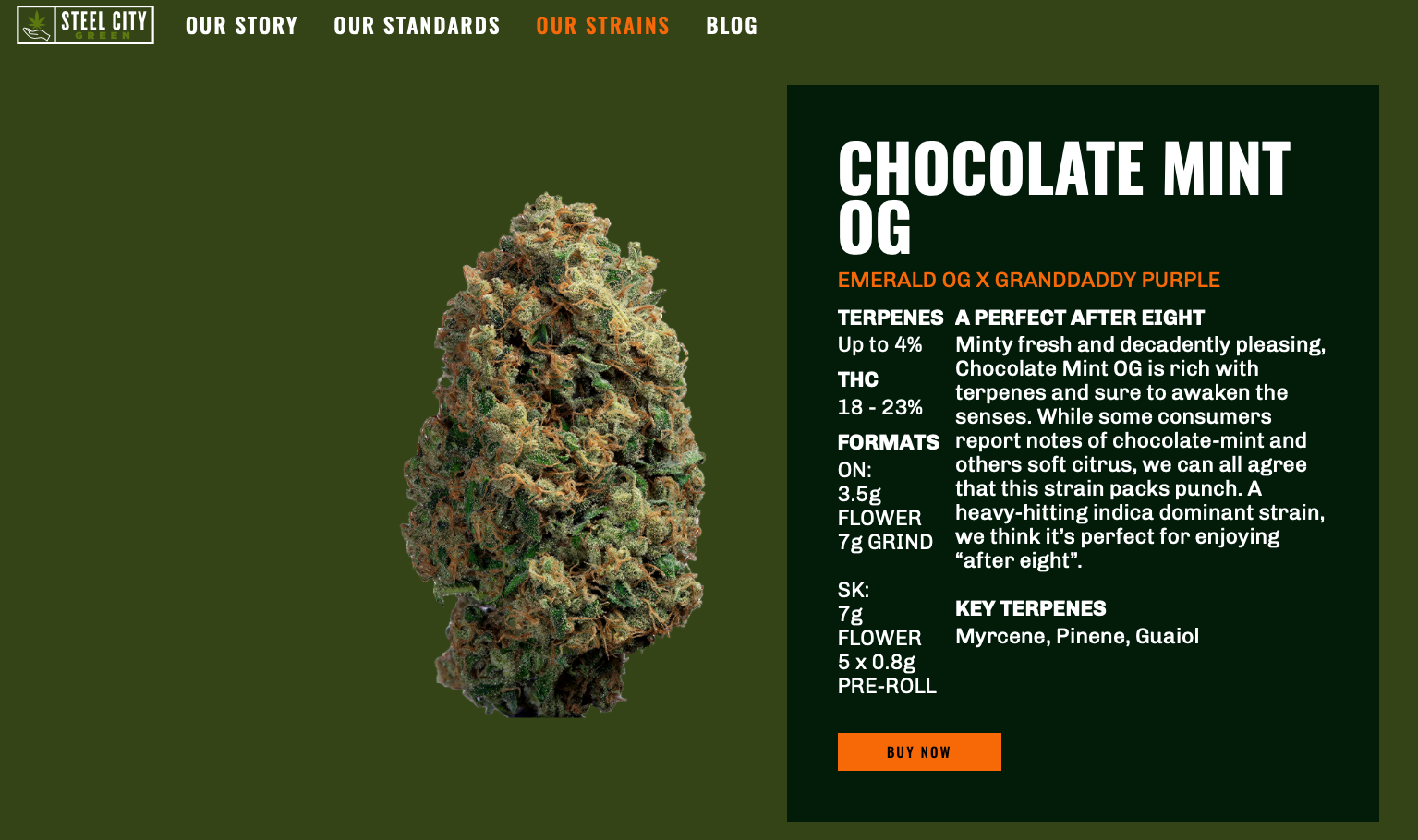
We began by crafting a striking visual identity that embodies the spirit of the brand. We then wrote the Steel City Green story, pinpointing its unique value proposition. We supported this narrative with facts that validate the claims made about the brand. Drawing upon the city's working-class roots, we connected the brand to a product quality-focused consumer. Emphasizing the brand's ethos of "working harder to charge less for great cannabis," we positioned Steel City Green as "Premium Quality, just not priced that way." This identity was paired with a visual identity system expressing the Steel Town working-class aesthetic. We commissioned original artwork by accomplished Hamilton-based designer John Godfrey, including the brand's now-iconic "3D Steel City Brick" visual, inspired by the city's iconic Hamilton Stamped bricks.
My Role
- As a consultant and full-service communication provider, I managed and delivered the project from start to finish on time and on budget.
- I spearheaded brand strategy and commissioned design and development talent as needed, working within the project's budget constraints.
- I contributed writing and creative direction.
- I invested in creating an original age gate solution specifically designed to meet Canadian cannabis industry standards, as current templates did not offer a regulatory satisfactory solution.
Results
- The site launched to an overwhelmingly positive response.
- The visual and written assets introduced with the site were leveraged across various touchpoints, including in-store, trade, and social channels.
- The site remains live today, with the same design, structure, key visual, and written assets, nearly two years into its life. This longevity is a testament to the robust planning and enduring strategy behind the project.
Credits
--------
If this case study resonated with you and you'd like to discover how I can bring value to your organization, please don't hesitate to reach out.